NRS Relief product catalogue
NRS Relief product catalogue
NRS Relief product catalogue
Role:
Role:
Role:
Art direction, Creative design, Photography
Art direction, Creative design, Photography
Art direction, Creative design, Photography
Softwares:
Softwares:
Softwares:
Indesign, Photoshop, Illustrator
Indesign, Photoshop, Illustrator
Indesign, Photoshop, Illustrator
Year:
Year:
Year:
2019
2019
2019
Overview
Overview
Overview
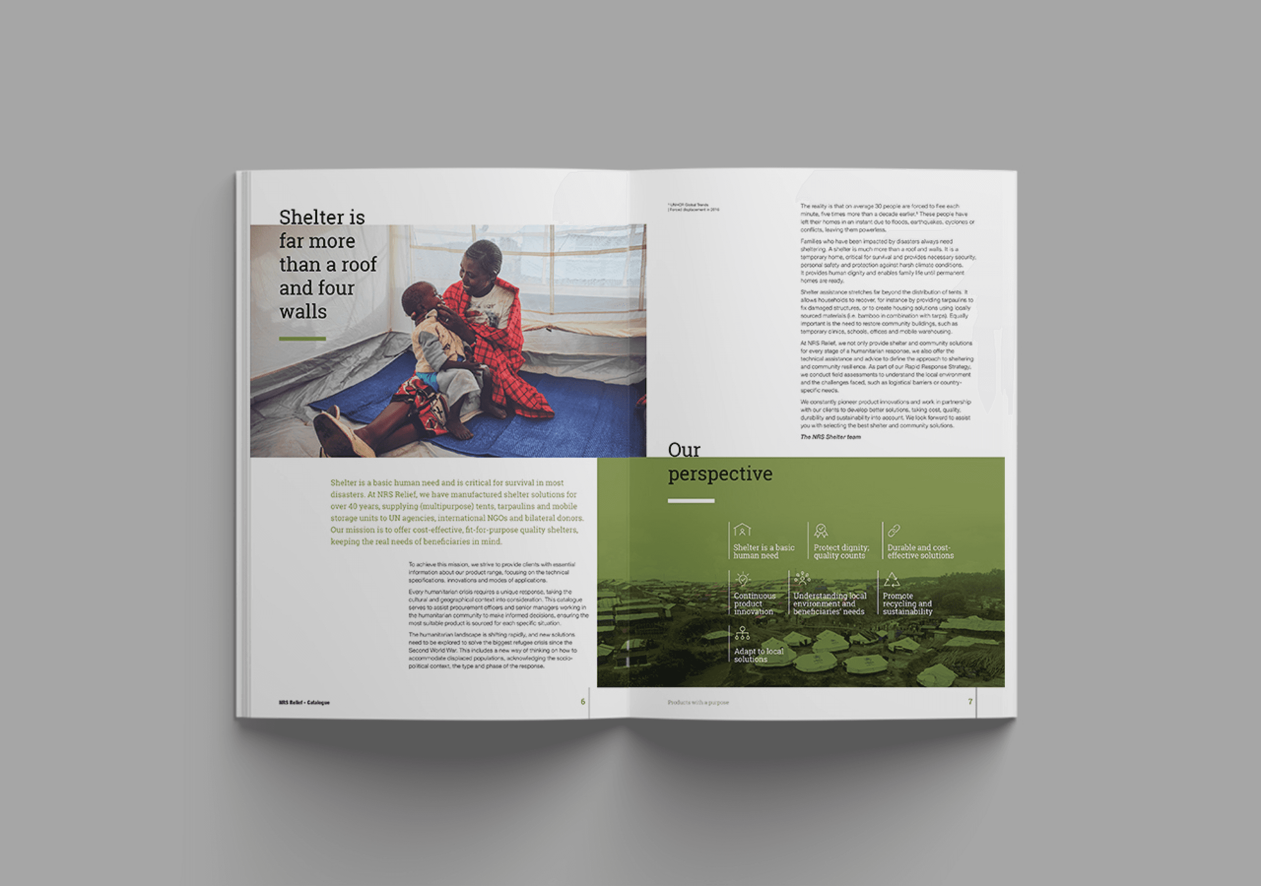
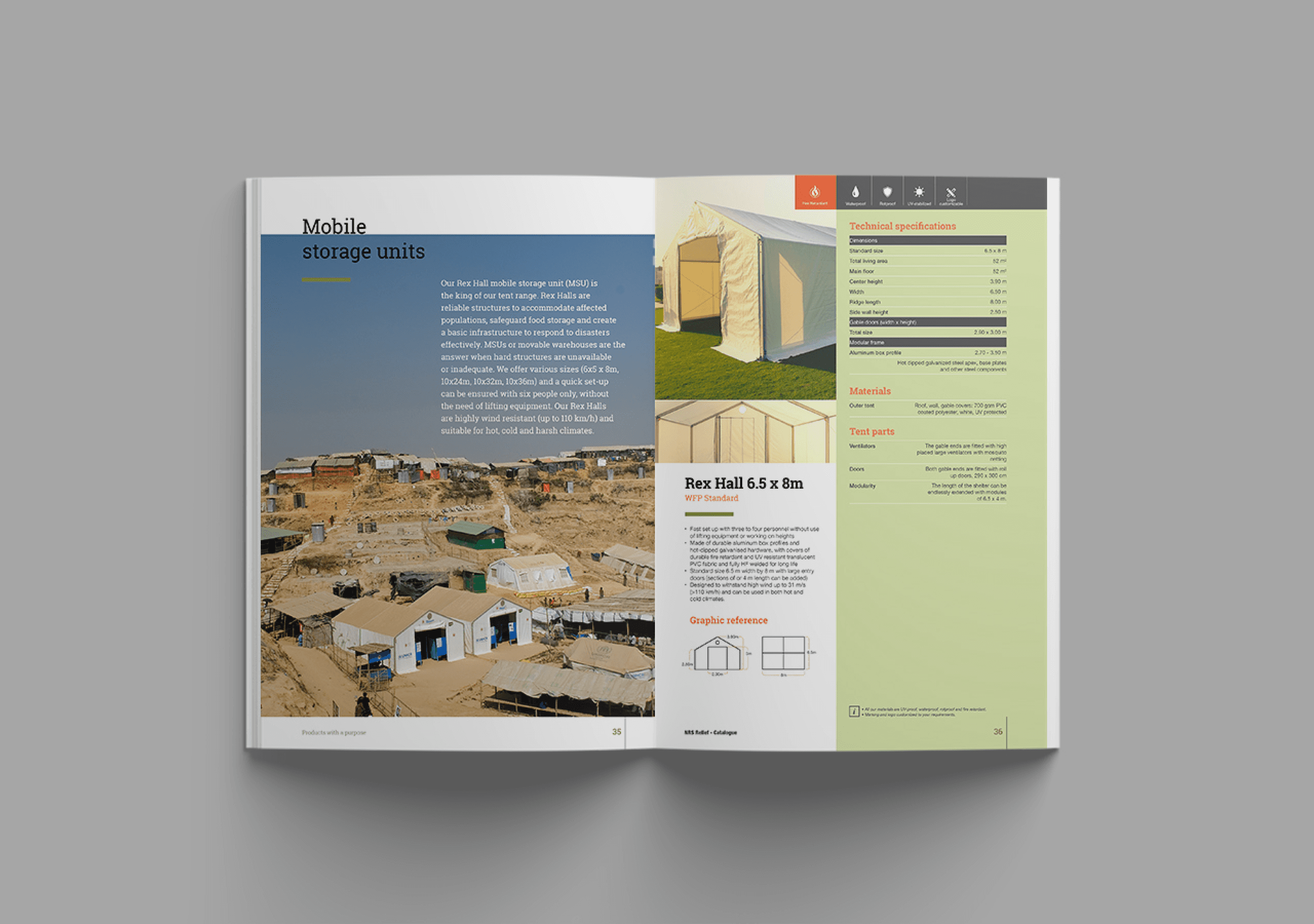
Products and specifications regularly get updated and as a part of it I had to design a completely new product catalogue from scratch with a new look and feel. In the past years, the sales team were mainly concerned about the heaviness of printed catalogues and other materials they carry for business trips. The challenge was to find an effective way of organizing the layout to display the the products and its specifications in a simple and more impactful way.
I used tables to structure the pages and text styles for each section to make the work easier through out the catalogue. The catalogue starts with an introduction page followed by an infographic spread that display the organization’s supply chain. Page separation in the beginning of each product category is designed with photos from the field and a short description. In addition to that, we hired a studio to photograph stand-alone photos of the Core Relief Items.
The book is presented in A4 size that is accessible and convenient, smaller in thickness but large enough to feature the products. At the same time, the book is easy to carry, almost like a clutch.


